
Nightly news reports promote increases in the number of COVID-19 cases. In contrast, the mortality rate is flat. Why are newscasts not talking about the mortality rate instead of the case rate?
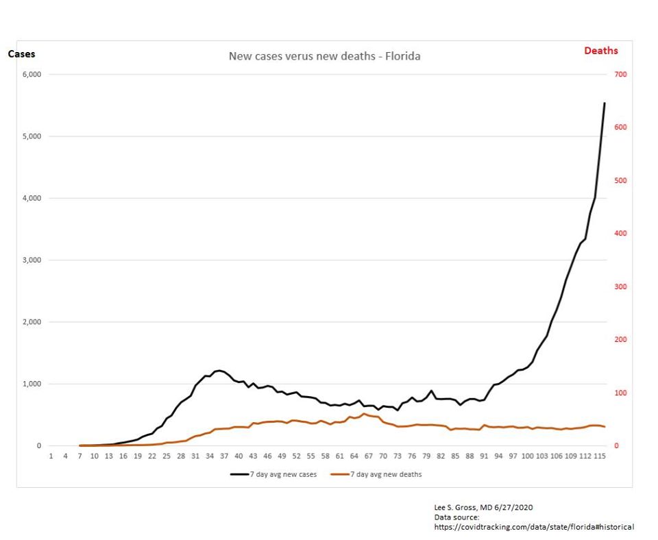
DATA SOURCE: https://covidtracking.com/data/state/florida
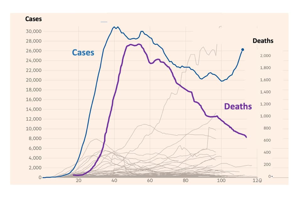
Great work, but I think the charts can be easily misread. The word “Deaths” over the right column could give the wrong impression about what the chart is saying because the “Cases” graph rolls right up into it. A first impression of the chart almost makes it look like the death rate is skyrocketing. Obviously, a close reading clarifies the issue. Unfortunately, today’s readers are not close readers. In my humble opinion, it needs to be reworked to avoid this misreading.
Agreed. Shared from a trusted friend. I hope to soon have an Excel-based spreadsheet posted with embedded plots.
It doesn’t matter if we get a million new cases of Covid as long as the number of new deaths keeps dropping. I guess we need to keep sending this info to the media to hammer home the point along with the message that we won’t be accessing their news any more. Access to no news is better than access to biased and corrupt news.
Working on a comprehensive Science-based examination of COVID-19 policies. Pulling together panel of experts. Gearing up for podcasts. Probably a couple of weeks out still.
good evening:
I am reading your book with great interest and anticipation.
I smile at your frustration: I identify with our plight because my father was “an honest politician”, as you. A rare breed indeed.
Thank you for serving, and thank you and your wife, Angie, for your courage, time and devotion.
Mine’ Hakim
Thank you Mine’! Angie is a truly special lady. She thought our lives would be much more boring when she married an engineer 😉
I agree with Troy Cooper’s comment above. In the first chart the blue line (cases) and the purple line (deaths) are clearly labeled so there is no confusion. In the second chart the black line (cases) and the brown line (deaths) can easily be confused because they are not labeled properly.
Agreed. Shared from a trusted friend. I hope to soon have an Excel-based spreadsheet posted with embedded plots.